A living system for websites, property experiences, film, social, print, signage, and future creative partners.
01Brand Idea
Luxury does not need to announce itself.
Luxury, Personally Represented.
Allison Gaddy is the enduring identity. This guide documents the visual system for her luxury real estate work.
Thoughtful representation, discretion, and personal confidence shape a presence that feels sophisticated without becoming overstated.
The monogram is the expressive gesture. Everything around it remains composed, sharp, and restrained.
Black. White. Exceptional photography. A restrained flash of rich gold.
02The Allison Standard
Prepared. Precise. Personally involved.
A property is intentionally positioned and produced, not simply placed on the market. The visual identity reflects the same standard: strategic preparation, clear decisions, disciplined execution, and calm confidence.
01
Prepared
02
Strategic
03
Clear
04
Precise
05
High-standard
06
Personally involved
07
Intentional
08
Confident
09
Calm
10
Producer-minded
11
Execution-focused
Restraint is not absence. It is evidence that the work has been considered, edited, and produced with purpose.
Brand character
A distinct point of view.
01
Refined
02
Personal
03
Confident
04
Discreet
05
Editorial
06
Timeless
07
Thoughtful
08
Distinctive
03Visual Philosophy
Use contrast instead of decoration.
01
Timeless, not nostalgic
02
Confident, never loud
03
Editorial, not ornamental
04
Cinematic, not theatrical
05
Architectural, not rigid
06
Personal, never precious
07
Modern, not trend-led
08
Expensive without excess
04Identity + Architecture
Enduring identity
The name, reputation, relationships, and approved artwork remain constant across markets, platforms, and affiliations.
Luxury real estate expression
Luxury Real Estate
The luxury real estate expression of the Allison Gaddy identity, documented in this guide. It organizes the approved artwork, exceptional property imagery, editorial pacing, and restraint.
Allison Gaddy is the enduring public identity. This system does not replace the Allison Gaddy name or create a second competing consumer identity. The approved Allison Gaddy artwork remains the primary recognizable identity.
Architecture · Working direction
Required third-party or brokerage marks are external to the core identity system. The enduring identity may also support speaking, leadership, publishing, and digital media. Those expressions remain outside this luxury real estate guide and must preserve the same approved identity artwork.
04AFoundational Identity Marks
Two primary marks. One identity.
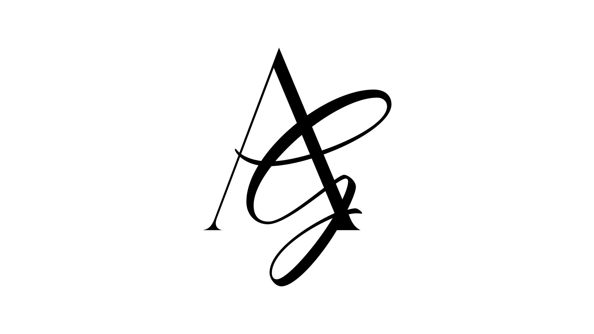
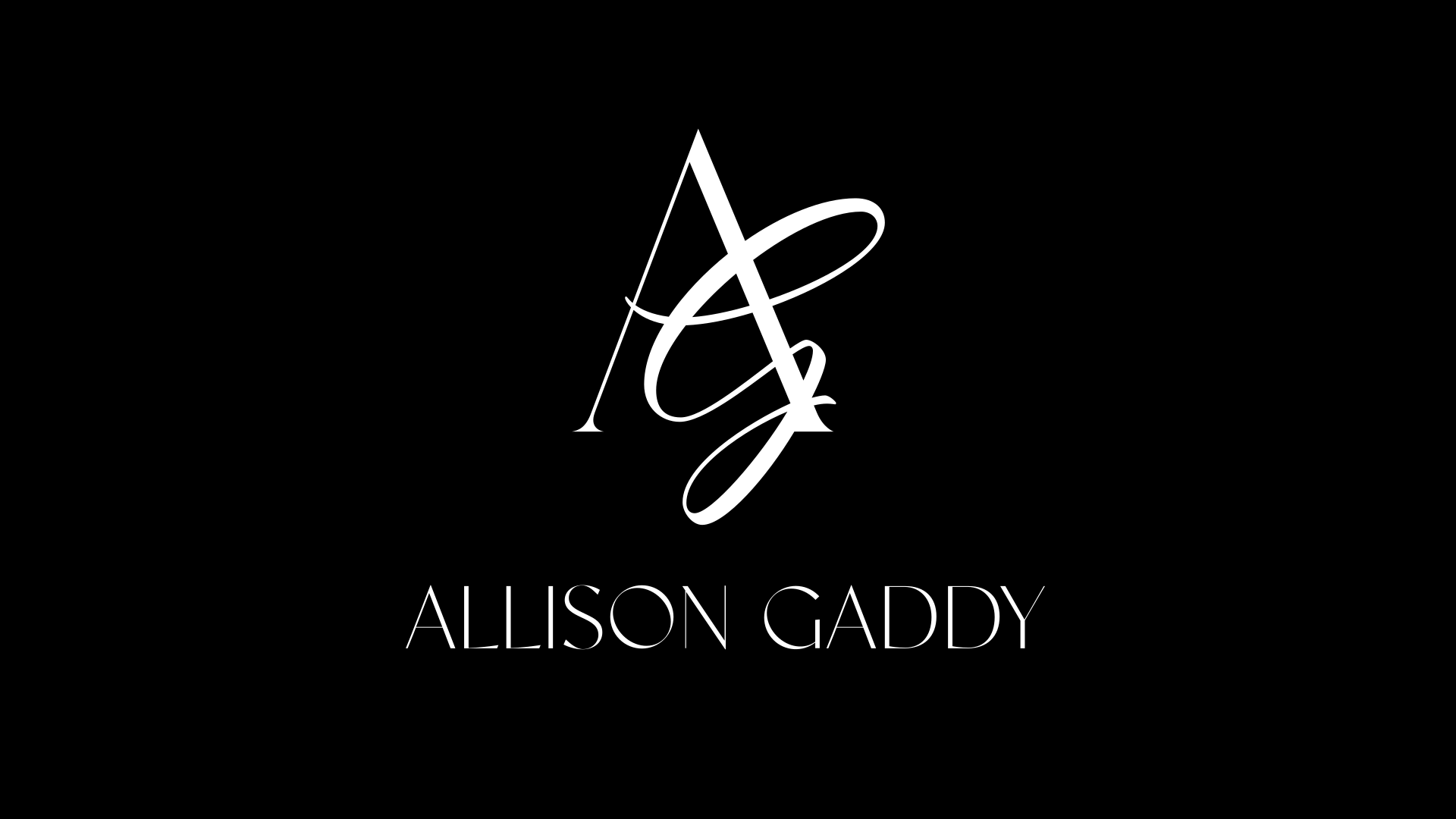
The Allison Gaddy identity is built around two foundational marks that must each be capable of standing independently: the AG monogram and the Allison Gaddy wordmark.
Each is intended to function as a complete primary identity asset in its own right. They are two complementary primary identity assets within one system, not two unrelated brands or logos.
“The AG monogram and the Allison Gaddy wordmark are each designed to carry the identity independently.
The monogram represents the identity symbolically.
The wordmark represents the identity by name.
Approved lockups bring the two together when context benefits from full recognition.”
01 · AG Monogram
Expressive Primary Mark
The AG monogram is the expressive signature of the identity. It is appropriate when recognition, symbolism, compact scale, or visual presence matters more than spelling out the full name.
Social avatar
Favicon
Video watermark
Embossing
Foil
Architectural applications
Small branded details
Select editorial moments
Use the real supplied monogram artwork. Do not redraw, recreate, alter, or typeset it.
Settled identity direction
02 · Allison Gaddy Wordmark
Primary Name Mark
The Allison Gaddy wordmark is the enduring name identity. It must function as a complete primary mark when the AG monogram is absent. Its role is quieter and more authoritative than the expressive monogram.
Website headers
Business cards
Presentation covers
Brochures
Email signatures
Press / PR
Signage
Video closing frames
Formal brand applications
This wordmark is identity artwork. Do not recreate it with Italiana, Manrope, or any other font. Do not alter tracking, letterforms, proportion, weight, or geometry.
Final approved artwork
03 · Combined Lockups
Full Identity Configurations
Combined lockups are used when both symbolic recognition and full name recognition are useful. They do not supersede the independent monogram or independent wordmark. All three modes are legitimate uses of the same identity.
Visual Comparison
Three legitimate modes of one identity
AG Monogram
Expressive primary mark
Allison Gaddy
Primary name mark
AG + Allison Gaddy
Full identity lockup
Standalone Wordmark Study
Complete by name alone.
This visual evaluation treats the current wordmark as though the AG monogram does not exist. It tests whether the artwork feels complete, distinctive, balanced, and authoritative by itself. The artwork is not redesigned in these studies.
01
Black on white
02
White on black
03
Large editorial scale
04
Website-header scale
Menu
05
Business-card scale
North Texas Luxury Real Estate
06
Presentation cover
Select Representation
07
Signage-style application
08
Video closing card
allisongaddyhomes.com
09
Foil / embossing concept
Material proof required
10
Press / editorial masthead
Profile
A considered approach to North Texas luxury real estate.
Designer ReviewIf optical spacing, kerning, proportion, or small-size performance ever needs refinement, return the artwork to Ann. Do not correct or rebuild it inside Lovable.
Wordmark Format Studies
One artwork, different fields.
The square example is a composition test, not a new logo configuration. The artwork remains intact, with no re-stacking, re-lettering, compression, or stretching.
Horizontal Field
Square / Centered Field
Name-stacked horizontal configuration
Ann’s final delivery adds a horizontal configuration with the name set on two lines beside the monogram. Use it where the standard horizontal lockup is too wide.
Locked
Final delivery received: monogram, wordmark, horizontal, name-stacked horizontal, and square configurations are the official identity assets.
Identity Hierarchy
AG Monogram
Expressive Primary Mark
Allison Gaddy Wordmark
Primary Name Mark
Combined Lockups
Full Identity Configurations
Supporting Typography
Italiana
Primary editorial / display typeface
Manrope
Primary structural / functional typeface
Wordmark + monogram
Custom identity artwork
Never use Italiana to imitate the Allison Gaddy wordmark. Never use typed text as a substitute for either primary identity mark. “North Texas Luxury Real Estate,” professional titles, geography, brokerage information, and other descriptors remain separate supporting typography and are not part of the wordmark artwork.
The relationship
A person may encounter only the AG and still encounter the Allison Gaddy identity.
A person may encounter only the Allison Gaddy wordmark and still encounter the complete Allison Gaddy identity.
When both appear together, they form the full lockup.
Locked
The AG monogram direction is the settled expressive identity direction.
Locked
The standalone Allison Gaddy wordmark is final approved artwork from Ann’s delivery, with vector masters available.
05Logo System
Working identity artwork.
Use supplied artwork as-is. Never redraw, recolor, retype, stretch, outline, trace, or rebuild the monogram or name artwork.
Settled working identity assets
Locked
Final identity assets: five configurations from Ann’s delivery, each in black and white.
Locked
Vector masters: SVG, PDF, and AI files for production and fabrication.
Pending
Still to define: numerical clear space, minimum sizes, and specialty-finish files.
06Logo Use Matrix
Choose the mark for the job.
Use the five final configurations from Ann’s delivery: monogram, wordmark, horizontal, name-stacked horizontal, and square. Numerical clear space and minimum sizes remain pending.
Horizontal lockup
Monogram
Stacked lockup
Use case
Preferred lockup
Color
Background
Breathing room
Caution
Website header
Horizontal lockup
Black or white
Solid or calm field with decisive contrast
Keep a generous quiet field around the full name
Do not compress into crowded navigation
Dark website header
Horizontal lockup
White
Black or consistently dark field
Separate from navigation and viewport edges
Avoid bright or detailed footage behind it
Light website header
Horizontal lockup
Black
White or very light neutral field
Separate from navigation and viewport edges
Do not use on midtone imagery
Social profile image
Monogram
Black or white
Solid opposite-color field
Center with visible air on every side
Test the platform crop before publishing
Instagram avatar
Monogram
White
Solid black field
Allow for the circular platform crop
Never use the horizontal lockup at avatar scale
Reel watermark
Monogram
White preferred
Quiet dark footage or protected contrast field
Keep clear of interface overlays and edges
Remove when footage becomes visually busy
YouTube / video watermark
Monogram
White preferred
Dark or controlled footage
Use a safe corner with uninterrupted space
Keep subtle; never compete with the property
Video closing card
Horizontal or stacked
White on black
Solid black closing field
Give the mark the field, not a decorative frame
Hold long enough to recognize; motion pending
Business card
Horizontal or stacked
Black or white
Solid white or black stock
Keep contact details outside the identity field
Proof fine strokes at final production size
Presentation cover
Stacked or horizontal
Black or white
Solid field or quiet photography
Use one focal position with generous margin
Avoid competing title treatments
Brochure cover
Horizontal or stacked
Black or white
Solid field or calm architectural image
Protect the full lockup from trim and folds
Use monogram only when the name appears elsewhere
Signage
Stacked or horizontal
White or black
Maximum-contrast material or field
Air must remain visible at viewing distance
Final minimums and fabrication proofs pending
Small digital interface
Monogram
Black or white
Solid opposite-color field
Increase the mark until fine strokes hold
Do not simplify or redraw the artwork
Large architectural application
Stacked or monogram
Material-dependent
Controlled high-contrast substrate
Scale from viewing distance, not page proportions
Fabrication, lighting, and vectors pending
Email signature
Monogram
Black
White field
Separate from contact lines with open space
Raster scaling and dark-mode behavior require testing
Print stationery
Horizontal or monogram
Black
White paper; gold only as proven finish
Protect from trim, rules, and address blocks
Use production artwork when vector masters arrive
Working direction
Breathing room is assessed visually until final geometry is approved.
Pending
Numerical minimum sizes, exact clear-space ratios, and production masters.
07Logo Scale + Clear Space
Protected areaGeometry pending
Protect the gesture.
Keep generous air around every lockup. Until vector geometry is approved, treat the demonstrated area as a visual principle, not a production measurement.
Pending
Exact clear-space ratio and production minimum sizes.
16 pxFavicon test
28 pxMobile test
48 pxWatermark test
96 pxAvatar test
These are visual stress tests only, not approved production minimums. If fine strokes disappear, increase the mark rather than altering the artwork.
08Official Color System
Black and white are not placeholders. They are the brand.
Primary Black#000000
Primary White#FFFFFF
Signature Rich Gold#B19A55
Optional Mineral Gray#D8D5CF
Black + White
Dominate every expression.
Rich Gold
Gold behaves like jewelry.
Mineral Gray
Optional support for hierarchy, borders, and breathing room.
09Typography
Selected Typography SystemScale and production refinement pending
Italiana + Manrope is the selected typography system. Italiana is the Primary Editorial / Display Typeface. Manrope is the Primary Structural / Functional Typeface.
Editorial scale.
Italiana provides atmosphere, elegance, scale, and fashion-house character. Manrope provides modern structure, clarity, utility, and digital discipline.
Uppercase eyebrow
Highly readable body copy remains calm and direct. Generous spacing lets imagery and ideas lead.
259
View residence
“The monogram carries the gesture. Italiana creates the editorial moment. Manrope carries the information.”
Italiana · Editorial voice
Reserved for moments that deserve atmosphere.
Use for display headlines, property names, opening statements, selected pull quotes, campaign language, and occasional high-impact statistics.
Never use for long copy, navigation, forms, dense data, legal copy, buttons, or complex mobile interfaces.
Manrope · Structural voice
The clear, disciplined carrier of information.
Use for navigation, body copy, buttons, labels, forms, metadata, captions, specifications, disclosures, statistics, and controls.
Use 400, 500, and 600 intentionally. Do not create hierarchy by cycling through every available weight.
Working Type Hierarchy
A restrained set of roles for print and screen. The three sizes in responsive display rows indicate large desktop, desktop or tablet, and mobile.
Display XL
Acreage Living, Refined
Family
Italiana
Size
96 / 64 / 48 px
Weight
400
Line height
0.94
Letter spacing
0
Capitalization
Sentence case
Ideal use
Campaign statement or singular editorial opening
Mobile
48 px; limit to 3 short lines
Display L
Acreage Living, Refined
Family
Italiana
Size
72 / 56 / 44 px
Weight
400
Line height
0.98
Letter spacing
0
Capitalization
Sentence case
Ideal use
Page or section opening
Mobile
44 px; balance line breaks manually
Display M
Acreage Living, Refined
Family
Italiana
Size
52 / 44 / 38 px
Weight
400
Line height
1.02
Letter spacing
0
Capitalization
Title or sentence case
Ideal use
Property title or feature story
Mobile
38 px; switch to Manrope if space is dense
Heading 1
Acreage Living, Refined
Family
Italiana
Size
42 / 38 / 34 px
Weight
400
Line height
1.08
Letter spacing
0
Capitalization
Sentence case
Ideal use
Primary content heading
Mobile
34 px
Heading 2
Acreage Living, Refined
Family
Italiana
Size
32 / 30 / 28 px
Weight
400
Line height
1.12
Letter spacing
0
Capitalization
Sentence case
Ideal use
Major subsection
Mobile
28 px
Heading 3
Acreage Living, Refined
Family
Manrope
Size
20 / 18 / 18 px
Weight
500
Line height
1.3
Letter spacing
0
Capitalization
Sentence case
Ideal use
Functional subsection and compact layouts
Mobile
18 px; always Manrope
Editorial pull quote
Acreage Living, Refined
Family
Italiana
Size
38 / 34 / 30 px
Weight
400
Line height
1.18
Letter spacing
0
Capitalization
Sentence case
Ideal use
One selected editorial quotation
Mobile
30 px; keep short
Body Large
Acreage Living, Refined
Family
Manrope
Size
18 / 18 / 17 px
Weight
400
Line height
1.65
Letter spacing
0
Capitalization
Sentence case
Ideal use
Opening copy and key explanations
Mobile
17 px
Body Standard
Acreage Living, Refined
Family
Manrope
Size
16 px
Weight
400
Line height
1.65
Letter spacing
0
Capitalization
Sentence case
Ideal use
Primary reading text
Mobile
16 px minimum
Body Small
Acreage Living, Refined
Family
Manrope
Size
14 px
Weight
400
Line height
1.6
Letter spacing
0
Capitalization
Sentence case
Ideal use
Secondary description
Mobile
14 px minimum
Eyebrow / label
Acreage Living, Refined
Family
Manrope
Size
11 px
Weight
500
Line height
1.4
Letter spacing
+0.16em
Capitalization
Uppercase
Ideal use
Short category or section label
Mobile
11 px; never paragraph length
Navigation
Acreage Living, Refined
Family
Manrope
Size
13 px
Weight
500
Line height
1.3
Letter spacing
+0.04em
Capitalization
Title case
Ideal use
Primary and secondary navigation
Mobile
14 px minimum in menus
CTA / button
Acreage Living, Refined
Family
Manrope
Size
12 px
Weight
600
Line height
1
Letter spacing
+0.10em
Capitalization
Uppercase
Ideal use
Short, explicit actions
Mobile
13 px; 44 px minimum target
Caption
Acreage Living, Refined
Family
Manrope
Size
12 px
Weight
400
Line height
1.5
Letter spacing
0
Capitalization
Sentence case
Ideal use
Image context and credits
Mobile
12 px minimum
Metadata
Acreage Living, Refined
Family
Manrope
Size
12 px
Weight
500
Line height
1.4
Letter spacing
+0.04em
Capitalization
Uppercase or title case
Ideal use
Date, location, category, availability
Mobile
12 px; wrap as grouped facts
Property statistic
5,216 SQ FT
Family
Italiana or Manrope
Size
48 / 40 / 32 px
Weight
400 / 500
Line height
1
Letter spacing
0
Capitalization
Uppercase unit
Ideal use
One expressive fact or clean data group
Mobile
32 px; use Manrope for dense groups
Numeric data
$4,250,000 · 3.63 ACRES
Family
Manrope
Size
16 px
Weight
500
Line height
1.4
Letter spacing
0
Capitalization
As entered
Ideal use
Tables, specifications, prices, measurements
Mobile
16 px; tabular alignment where needed
Legal / disclosure
Information deemed reliable but not guaranteed.
Family
Manrope
Size
12 px
Weight
400
Line height
1.6
Letter spacing
0
Capitalization
Sentence case
Ideal use
Required legal and disclosure copy
Mobile
12 px minimum; never compressed
Locked
Selected system: Italiana for primary editorial/display use and Manrope for primary structural/functional use.
Working direction
Playfair Display is an approved production substitute serif only when Italiana cannot satisfy a verified legibility, weight, fabrication, or true-italic requirement.
Pending
Exact scale, production proofs, and special-use applications remain subject to refinement.
Technical fallback fonts are emergency rendering fallbacks only and are not intentional brand alternatives. The Allison Gaddy wordmark is identity artwork and must never be recreated with typed text. “North Texas Luxury Real Estate,” professional titles, geography, brokerage information, and other descriptors are separate supporting typography, not part of the wordmark artwork. Decorative script fonts are not part of this system. Do not create faux italics; use scale, position, line breaks, spacing, weight, gold on solid fields, or contrast for emphasis.
10Typography Stress Test
One system. Sixteen environments.
These are performance proofs, not finished collateral. Every test asks whether editorial character and useful information can coexist without distorting Italiana or shrinking Manrope below comfortable reading sizes.
390Mobile
768Tablet
1280Desktop
1440+Large desktop
01 · Luxury website hero
Acreage Living, Refined
Italiana 72–96 · Manrope utility02 · Dark cinematic listing page
259 King Ranch Court
White type only over photography03 · Light editorial website
Your North Texas Luxury Advisor
Open scale with black type04 · Property detail page
Designed for daily living
Serif story · sans specifications05 · Listing presentation cover
Select Representation
One title, one mark, generous air06 · Listing presentation interior
A considered market position
Manrope carries the analysis07 · Instagram / Reel cover
Inside 259 King Ranch Court
Short serif title at 38 px+08 · Market insight social graphic
North Texas · Q3 2026
Manrope data leads09 · Business cardApproved logo artwork, Manrope details10 · Property brochure
Architecture in conversation with land
Editorial opening, readable body11 · Signage
Private Residence
Distance-first Manrope support12 · Mobile navigation
Properties · About · Connect
Manrope only, 14 px minimum13 · Contact form
Request a private showing
Manrope labels and controls14 · Property statistics
5,216 SQ FT · 3.63 ACRES
Manrope for grouped data15 · Legal disclosure
Information deemed reliable but not guaranteed.
Manrope 12 px / 1.6 minimum16 · Video title frame
Acreage Living, Refined
Brief Italiana title, clean fade
259 King Ranch Court · Selected-system test
Acreage Living, Refined
5,216 SQ FT3.63 ACRES
Private showings, daily
Italiana + Manrope separates atmosphere from property facts.Production substitute evidence
Acreage Living, Refined
5,216 SQ FT3.63 ACRES
Private showings, daily
Playfair Display is available only when a verified production requirement rules out Italiana.
Light editorial selected-system test
Your North Texas Luxury Advisor
Working With Allison
Select RepresentationConnect with Allison
Small-screen rule
Italiana begins at 28 px for production display use.
Below 28 px, or whenever names, data, controls, or required information become fragile, switch the application to Manrope. Never condense, slant, outline, or otherwise distort Italiana.
Working direction
Strong: website openings, editorial covers, property names, pull quotes, and video titles.
Working direction
Caution: long property names, thin strokes over imagery, grouped numerals, social crops, and distant signage.
Pending
Human review: real print proofs, installed signage, live forms, campaign templates, and final approval.
11Photography + Film
The property supplies the living color.
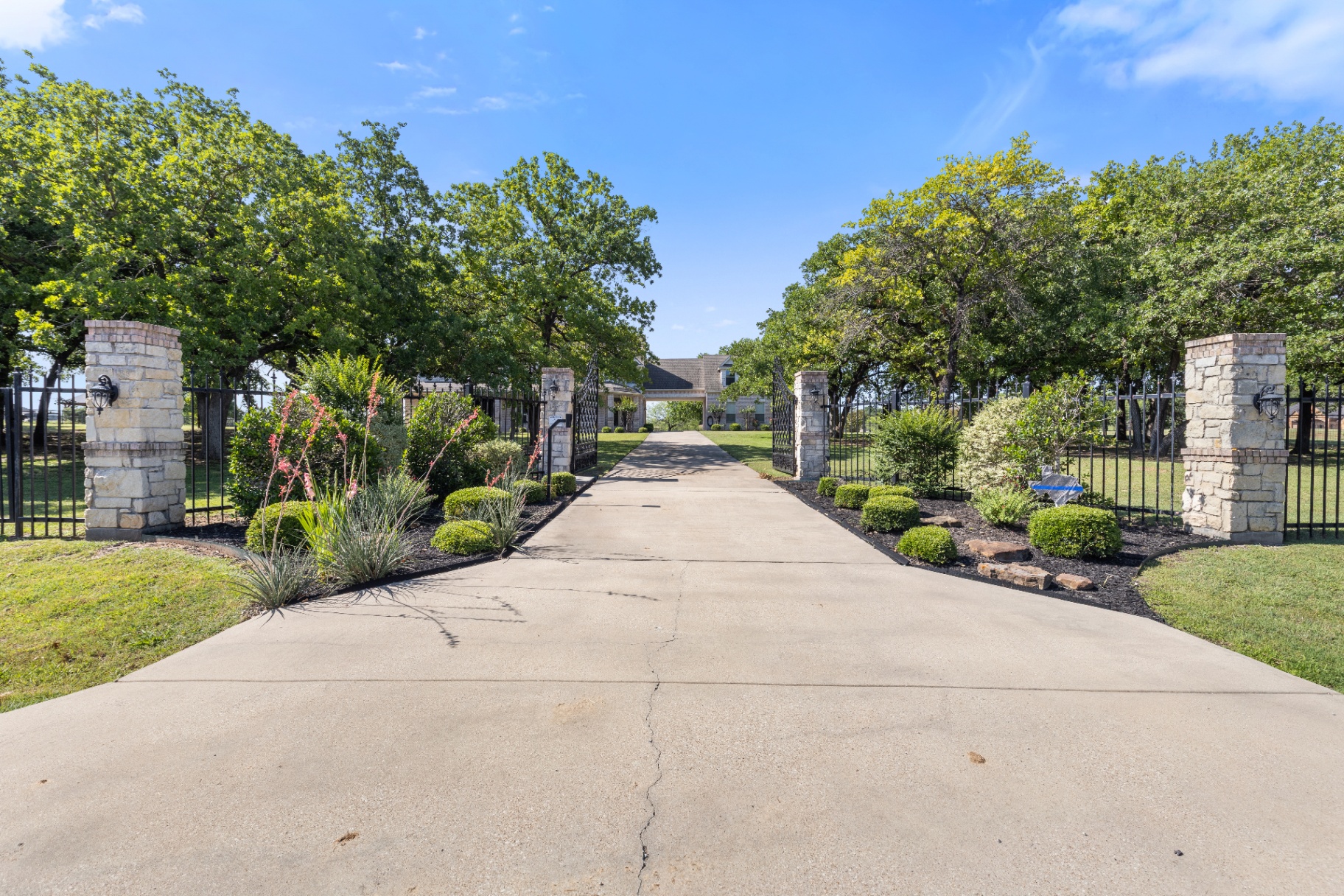
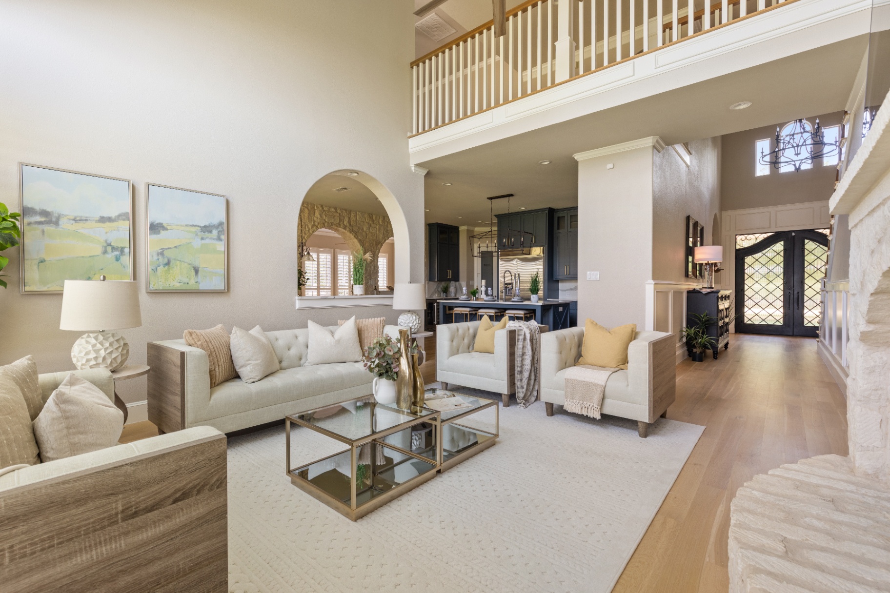
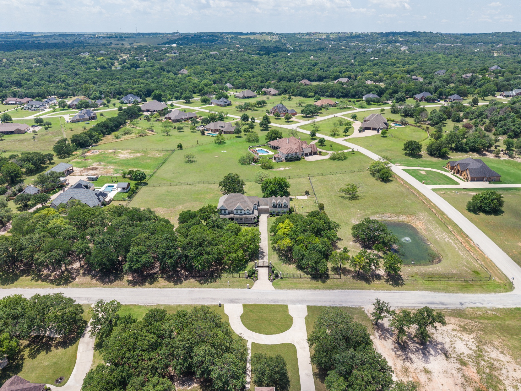
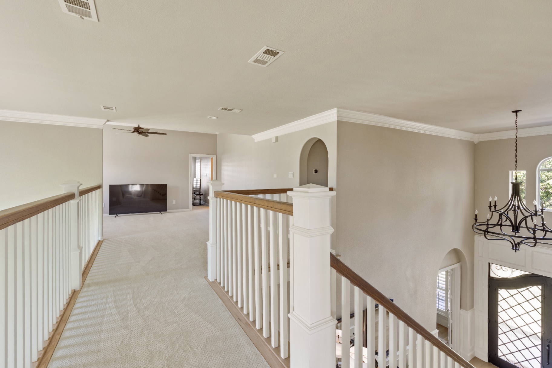
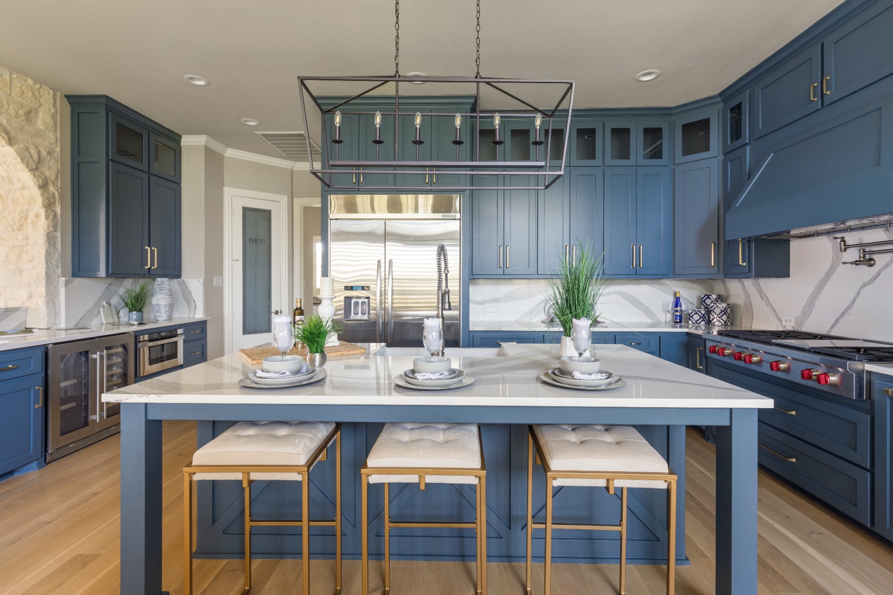
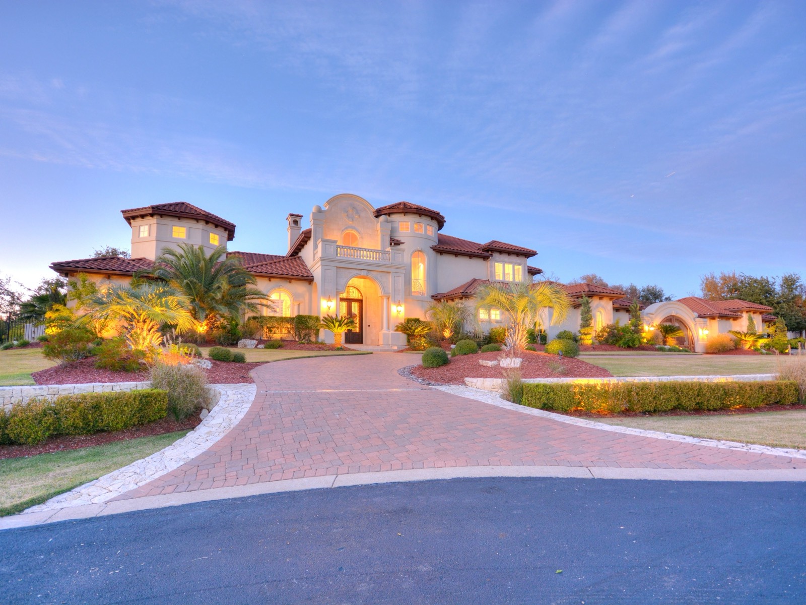
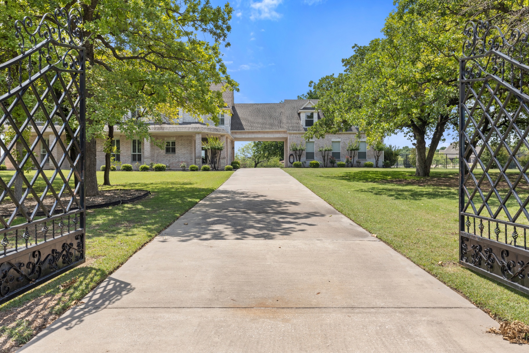
Favor true architecture, natural materials, generous establishing views, specific details, and cinematic transitions in light.
Keep color honest. Do not desaturate, tint, warm, cool, or force property imagery into the palette.
Film should open with place, move through atmosphere and detail, then close on the approved mark with quiet confidence.
Visual-Story Sequence
A flexible narrative for photographers, filmmakers, editors, and image-generation tools. Not every property needs every frame; preserve the arc, then edit to what is true and distinctive.
Storytelling guidance
01
Place / context
02
Arrival
03
Hero exterior
04
Hero interior
05
Architectural width
06
Material detail
07
Emotional detail
08
Transitional moment
09
Lifestyle clue
10
Land / neighborhood / context
11
Aerial
12
Twilight or emotional close
Bright exteriorDark interiorDetailed backgroundAerial establishing viewInterior daylightTwilight close
12Video Identity
The film moves. The identity stays composed.
The static identity must work perfectly without animation. Let footage carry movement; the mark supplies recognition and closure.
Pending
Animated logo and motion identity · Future Development
Mark color
White over dark footage; black only over consistently light footage.
Safe corners
Use an uninterrupted corner, away from crops, captions, controls, and platform overlays.
Watermark timing
Appear when attribution is useful; disappear during visually busy or emotionally important sequences.
Opening title
Begin with place or a short statement. Do not force the logo into every opening frame.
Property name
Use upright Italiana at deliberate scale; Manrope carries location and facts.
Closing card
End on a solid black or white field with the approved lockup and one clear action.
Moving footage
Never track the logo over motion or let it compete with architecture, people, or landscape.
Contrast
Test frame by frame. A mark that disappears briefly has failed.
Busy backgrounds
Move to a clean frame or remove the watermark; never add effects to rescue contrast.
13Editorial Composition
One idea. One image. Enough room.
Use large image fields, decisive crops, fine rules, uneven columns, deliberate pauses, and a clear reading order.
Asymmetry should create tension, not disorder. Oversized typography is an event, not a default.
Use contrast instead of decoration.
14Voice in Design
Say what is true. Then stop.
This is not a messaging guide. It is a writing filter that keeps language as clear, restrained, and useful as the visual identity.
Prefer
Specific over grandiose
Declarative over flowery
Clear over clever
Precise over vague
Shorter copy over overexplaining
Real property details over luxury clichés
Confident language over exaggerated claims
Avoid
Unparalleled
Opulent
Prestigious
Elevated living
Luxury redefined
One-of-a-kind unless factually supportable
Generic superlatives
Decorative lifestyle copy without meaning
15Digital System
Sharp. Spacious. Cinematic.
View residencePrivate inquiry →
Large imagery
Strong hierarchy
Fine rules
High contrast
Minimal radius
Little or no shadow
Restrained controls
Editorial asymmetry
Text width
Keep reading copy near 55–70 characters per line; display copy may be narrower.
Section rhythm
Use generous major-section pauses and a restrained smaller interval for related content.
Image-to-text ratio
Let imagery carry the majority of visual area on property-led pages; copy explains rather than competes.
Light / dark rhythm
Alternate only when content or pacing benefits. Do not stripe every section mechanically.
Buttons
Use short Manrope labels, clear verbs, strong contrast, and one primary action per view.
Radius
Use square or near-square corners. Small functional radii only; never rounded-everything.
Borders + rules
Use one-pixel lines for hierarchy, separation, and measured gold accents on solid fields.
Shadows
Use none by default. If separation is essential, prefer contrast or a fine border.
Cards
Avoid decorative card grids. Use repeated panels only when the information is genuinely modular.
Navigation
Keep it concise, Manrope-led, predictable, and quiet enough to let property imagery lead.
Forms
Use visible labels, comfortable type, direct errors, large targets, and no ornamental fields.
Gallery
Mix establishing width, detail, and pacing; preserve image ratio and avoid novelty transitions.
Full-bleed imagery
Use for arrival and emotional emphasis, with protected text contrast and controlled crops.
Editorial asymmetry
Create tension through unequal columns and placement while maintaining a clear reading order.
Mobile stacking
Stack in reading order, keep actions near context, and never shrink type to preserve desktop composition.
Gold
Reserve for fine rules, labels, selected states, and small actions on solid fields; never place gold over imagery.
The system is sharp, spacious, cinematic, and operational. It does not need decorative cards, pills, fake metallic effects, generic dashboards, or visual clutter.
16One Identity, Two Digital Moods
Dark Cinematic
Immersive property focus.
Black-dominant fields, dramatic photography and film, white type, restrained gold on solid fields, and slow cinematic pacing.
Dark versus light is a composition choice. It is not a different brand. The constants remain black, white, Rich Gold, approved AG artwork, the selected Italiana + Manrope system, exceptional imagery, negative space, and restraint.
A full-field opening creates place before facts arrive.
02
Gold stays small
Rules, labels, and selected actions carry the accent.
03
Details stay useful
Property information remains direct, structured, and easy to scan.
This case study records the live site’s strengths. Its Playfair Display and Montserrat pairing remains listing-site typography, and any approximate live-site gold does not replace the master Rich Gold value of #B19A55.
18Social
Just listed
259 King Ranch Court
Sold
A quiet conclusion
Market perspective
Value lives in the details
Reel cover
A considered point of view.
Inside the residence
Light, proportion, and material.
Build family resemblance, not repetitive templates. Use the monogram as an avatar or quiet watermark; never let it compete with the property.
18AStationery + Profiles
Everyday applications
The identity at arm’s length.
Business cards, letterhead, email signatures, and social profiles are the most repeated expressions of the brand. Each uses only Ann’s final artwork, the locked palette, and the selected Italiana + Manrope system.
Business cards
Allison Gaddy
North Texas Luxury Real Estate
allison@allisongaddy.com
214-572-5280
allisongaddyhomes.com
Front: white stock, black horizontal lockup, contact details in Manrope outside the identity field. Back: solid black with the white monogram alone. Proof fine strokes at final production size; foil or letterpress finishes follow the Materials section.
Letterhead
Allison Gaddy · North Texas Luxury Real Estate
Dear Client,
Body copy sets in Manrope at a comfortable reading size with generous line spacing. The page stays quiet: one mark at the top, one thin rule, and ample margin on every side.
Italiana is reserved for a salutation or a short closing line, never for full paragraphs.
White sheet, black artwork, black text. Rich Gold may appear only as a jewelry-scale detail such as the footer rule. Brokerage and legal matter sits in the footer, separate from the identity field.
Email signature
Allison Gaddy
North Texas Luxury Real Estate
allison@allisongaddy.com
214-572-5280
allisongaddyhomes.com
Use the AG monogram as a small PNG, never a large banner. Keep the contact information concise and set in Manrope. No gold text, no photography, no social icons in color; plain text links only.
Social profiles
Allison Gaddy
@allisongaddyhomes
North Texas Luxury Real Estate. Luxury, Personally Represented.
Allison Gaddy
@allisongaddyhomes
North Texas Luxury Real Estate. Luxury, Personally Represented.
The monogram is the avatar on every platform, centered on a solid black or white field with air on every side. Test each platform’s circular crop before publishing. The full name lives in the profile name field, not inside the avatar artwork.
19Materials
Black leatherBlind debossWhite cotton paperBlack letterpressBrushed metalEngraved or dimensionalTextured white paperRich Gold foilGlassEtched or applied vinylPresentation caseBlack wrap, white mark
The restrained identity is designed to become memorable through physical execution. Digital Rich Gold is exactly #B19A55. Foil, raised lettering, metal, engraving, embossing, glass, leather, and textured paper are real materials selected by proof, not effects simulated on screen.
20Signage
Distance demands clarity.
Use approved black or white artwork.
Protect clear space and stroke integrity.
Test at full installation size and real viewing distance.
Keep legal or required third-party matter outside the core identity field.
Pending
Production minimums, substrates, lighting, installation, and legal supplement.
21Do / Do Not
Do
Use black and white confidently
Let photography bring living color
Use gold sparingly
Protect negative space
Use supplied artwork only
Test every real production context
Do not
Redraw or retype the identity
Add ornamental luxury colors
Filter exceptional photography
Make every action gold
Simulate foil with gradients
Crowd the system to prove value
23Typography Evidence
Appendix · Decision Lab
Evidence behind the selection.
Italiana + Manrope is the selected typography system. These references remain documented as selection evidence and production context, not equal candidates.
Selected system · Italiana + Manrope
Typography Decision Lab
The same content records three factual references. Playfair Display may substitute for Italiana only when a verified legibility, weight, fabrication, or true-italic requirement cannot be met. Technical fallbacks remain emergency rendering fallbacks only.
Selected System
Quiet confidence, clearly expressed.
Luxury does not need to announce itself.
A measured identity gives exceptional homes space to speak, while every detail remains intentional.
This retained comparison isolates typography. Every system uses the same layouts, photography, copy, colors, spacing, and components. Only the editorial serif and structural sans change.
Italiana + Manrope is the selected typography system. Playfair Display is an approved production substitute serif only when Italiana cannot satisfy a verified legibility, weight, fabrication, or true-italic requirement.
Comparison control
Same 20 examples · same content · same art direction · same hierarchy · typography only
A. Selected System
Italiana + Manrope
Italiana editorial · Manrope structural
01Brand statement
Luxury does not need to announce itself.
02Name
Allison Gaddy
Typed comparison only. The approved name artwork remains unchanged.
03Property title
259 King Ranch Court
04Editorial headline
Acreage Living, Refined
05Advisor positioning
Your North Texas Luxury Advisor
06Property statistics
5,216 SQ FT · 3.63 ACRES
07CTA
Private showings, daily
08Navigation
09Body copy
Set across 3.63 acres, 259 King Ranch Court brings architecture, land, and daily life into one considered experience. Generous rooms open to long views, while precise materials and quiet transitions give the residence its sense of permanence.
10Legal / disclosure
Information is deemed reliable but not guaranteed. Dimensions, acreage, and property details should be independently verified.
11Dark cinematic listing hero
Private residence
Acreage Living, Refined
259 King Ranch Court
12Light editorial website hero
Select representation
Your North Texas Luxury Advisor
Working With Allison
13Listing presentation cover
Listing presentation
259 King Ranch Court
Prepared for private review
14Listing presentation interior page
Property position
A considered market introduction.
Set across 3.63 acres, 259 King Ranch Court brings architecture, land, and daily life into one considered experience. Generous rooms open to long views, while precise materials and quiet transitions give the residence its sense of permanence.
5,216 SQ FT3.63 ACRES
15Instagram / Reel cover
Inside the residence
Acreage Living, Refined
16Business card
Allison Gaddy
Luxury Real Estate Advisorallisongaddyhomes.com
17Brochure spread
Architecture and land
Acreage Living, Refined
Set across 3.63 acres, 259 King Ranch Court brings architecture, land, and daily life into one considered experience. Generous rooms open to long views, while precise materials and quiet transitions give the residence its sense of permanence.
Typed comparison only. The approved name artwork remains unchanged.
03Property title
259 King Ranch Court
04Editorial headline
Acreage Living, Refined
05Advisor positioning
Your North Texas Luxury Advisor
06Property statistics
5,216 SQ FT · 3.63 ACRES
07CTA
Private showings, daily
08Navigation
09Body copy
Set across 3.63 acres, 259 King Ranch Court brings architecture, land, and daily life into one considered experience. Generous rooms open to long views, while precise materials and quiet transitions give the residence its sense of permanence.
10Legal / disclosure
Information is deemed reliable but not guaranteed. Dimensions, acreage, and property details should be independently verified.
11Dark cinematic listing hero
Private residence
Acreage Living, Refined
259 King Ranch Court
12Light editorial website hero
Select representation
Your North Texas Luxury Advisor
Working With Allison
13Listing presentation cover
Listing presentation
259 King Ranch Court
Prepared for private review
14Listing presentation interior page
Property position
A considered market introduction.
Set across 3.63 acres, 259 King Ranch Court brings architecture, land, and daily life into one considered experience. Generous rooms open to long views, while precise materials and quiet transitions give the residence its sense of permanence.
5,216 SQ FT3.63 ACRES
15Instagram / Reel cover
Inside the residence
Acreage Living, Refined
16Business card
Allison Gaddy
Luxury Real Estate Advisorallisongaddyhomes.com
17Brochure spread
Architecture and land
Acreage Living, Refined
Set across 3.63 acres, 259 King Ranch Court brings architecture, land, and daily life into one considered experience. Generous rooms open to long views, while precise materials and quiet transitions give the residence its sense of permanence.
18Signage-style distance treatment
259 King Ranch Court
Private residence
19Mobile header at 390px
Menu
259 King Ranch Court
Acreage Living, Refined
20Property data / details
Interior5,216 SQ FT
Land3.63 ACRES
ShowingsPrivate, daily
Residence259 King Ranch Court
C. Historical Reference
Inter Tight + PT Serif
Recorded current-site reference
01Brand statement
Luxury does not need to announce itself.
02Name
Allison Gaddy
Typed comparison only. The approved name artwork remains unchanged.
03Property title
259 King Ranch Court
04Editorial headline
Acreage Living, Refined
05Advisor positioning
Your North Texas Luxury Advisor
06Property statistics
5,216 SQ FT · 3.63 ACRES
07CTA
Private showings, daily
08Navigation
09Body copy
Set across 3.63 acres, 259 King Ranch Court brings architecture, land, and daily life into one considered experience. Generous rooms open to long views, while precise materials and quiet transitions give the residence its sense of permanence.
10Legal / disclosure
Information is deemed reliable but not guaranteed. Dimensions, acreage, and property details should be independently verified.
11Dark cinematic listing hero
Private residence
Acreage Living, Refined
259 King Ranch Court
12Light editorial website hero
Select representation
Your North Texas Luxury Advisor
Working With Allison
13Listing presentation cover
Listing presentation
259 King Ranch Court
Prepared for private review
14Listing presentation interior page
Property position
A considered market introduction.
Set across 3.63 acres, 259 King Ranch Court brings architecture, land, and daily life into one considered experience. Generous rooms open to long views, while precise materials and quiet transitions give the residence its sense of permanence.
5,216 SQ FT3.63 ACRES
15Instagram / Reel cover
Inside the residence
Acreage Living, Refined
16Business card
Allison Gaddy
Luxury Real Estate Advisorallisongaddyhomes.com
17Brochure spread
Architecture and land
Acreage Living, Refined
Set across 3.63 acres, 259 King Ranch Court brings architecture, land, and daily life into one considered experience. Generous rooms open to long views, while precise materials and quiet transitions give the residence its sense of permanence.
18Signage-style distance treatment
259 King Ranch Court
Private residence
19Mobile header at 390px
Menu
259 King Ranch Court
Acreage Living, Refined
20Property data / details
Interior5,216 SQ FT
Land3.63 ACRES
ShowingsPrivate, daily
Residence259 King Ranch Court
Neutral comparison matrix
Read for production context, not a new selection.
Criterion
A. Selected SystemItaliana + Manrope
B. Production ReferencePlayfair Display + Montserrat
C. Historical ReferenceInter Tight + PT Serif
Relationship to AG monogram
Restrained contrast leaves the script as the primary gesture.
Classic serif character creates a more expressive relationship.
Editorial serif and compact sans sit quietly beside the artwork.
Distinctiveness
Recognizable through unusual, high-contrast display forms.
Familiar within premium property and editorial contexts.
Distinctiveness depends more on composition than type alone.
Fashion / editorial quality
Fashion-led at large scale with disciplined sans support.
Traditional editorial character with established polish.
Magazine-like through serif and condensed structural contrast.
Timelessness
Classical construction with a contemporary structural counterpoint.
Established book and editorial references.
Familiar publishing behavior with modern utility.
Luxury signal
Quiet, high-fashion restraint.
Immediate, recognizable luxury convention.
Understated editorial sophistication.
Modernity
Strong through the contrast between Italiana and Manrope.
More classic than contemporary.
Modern structural tone with traditional editorial support.
Body readability
Manrope remains open and clear at reading sizes.
Montserrat is clear, with wider geometric character.
Inter Tight is efficient; PT Serif supports longer editorial reading.
Mobile performance
Strong when Italiana remains at deliberate display sizes.
Playfair remains legible across a broad display range.
Inter Tight uses narrow spaces efficiently; serif needs testing at small sizes.
Property-data clarity
Manrope produces disciplined, neutral data groups.
Inter Tight creates compact and efficient data presentation.
Signage strength
Strong contrast at scale; thin serif strokes require production proofs.
Robust recognition with familiar serif authority.
Condensed sans behavior supports distance; serif detail requires proofs.
Social performance
Distinctive at large display scale and concise crops.
Immediately readable and familiar in editorial social formats.
Flexible for dense, vertically constrained formats.
Listing-presentation performance
Clear division between editorial openings and information pages.
Polished, traditional listing-presentation behavior.
Efficient structure with a quieter editorial layer.
Website flexibility
Wide range when serif use remains selective.
Reliable across conventional property-site patterns.
Adaptable across lighter editorial and information-dense pages.
Risk of feeling generic or overused
Lower familiarity, with risk of overusing the distinctive display face.
Higher familiarity because the pairing is widely used in luxury contexts.
Structural sans may feel familiar unless composition remains specific.
Selection Recorded
Italiana + Manrope
Italiana is the Primary Editorial / Display Typeface. Manrope is the Primary Structural / Functional Typeface. Exact scale, production proofs, and special-use applications remain subject to refinement. Technical fallback fonts are emergency rendering fallbacks only and are not intentional brand alternatives.
Selected systemItaliana + ManropeProduction substitute serifPlayfair Display, verified need only
25Living Guide
Built to become more precise.
Locked
Core identity direction; final AG monogram, wordmark, and lockups from Ann’s delivery; black; white; Rich Gold #B19A55; photography-led system; selected Italiana + Manrope typography.
Working direction
Mineral Gray #D8D5CF, scale, production proofs, and special-use applications remain subject to refinement.
Pending
Numerical clear-space rules, minimum sizes, specialty-finish files, and legal or brokerage signage supplement.
Allison Gaddy Personal is governed separately. This guide defines the luxury real estate identity and does not introduce a separate personal-brand palette or visual system.
26Final Summary
Black. White. Exceptional photography. A restrained flash of rich gold.
Structure meets movement. Luxury becomes personal. A signature built to endure.
Luxury, Personally Represented.
Allison Gaddy · Living identity manual
22Downloads
Final files. Every format.
Ann’s final logo delivery for designers, printers, sign makers, and digital teams. Open the library only when you need a file.
Logo asset library
View previews and download files
Five configurations, black and white, with format, color, orientation, and use details.




 Select Representation